
Angular Tutorial: Custom Searchable Dropdown Component

Angular is one of the most popular JavaScript frameworks out there, notably with enterprise systems. In this article, you’ll learn how to create a custom searchable dropdown component which can search through an array of data and return the particular item a user searches for.
At the end of this article, you’ll create a real-world custom search component which searches for your favorite TV shows and displays some information about it to you.

The custom search component you’re creating will be similar to the one above, so, without further ado, let’s dive right in.
#1 Install Angular CLI
Before you can create an Angular Project, you need to have the Angular CLI installed. To install Angular, you’ll need NodeJS and NPM which can be downloaded and installed here.
When you have NPM on your computer, you can proceed to install Angular CLI by typing the following into the terminal
npm install -g @angular/cliThis will download and install the latest Angular CLI to your system. Once installed, you can check your version by typing
ng versionThis will confirm if it’s globally installed on your system and display the version installed (which should be the latest).
#2 Create an Angular Project Using Angular CLI
Now that Angular-CLI is installed, you can create a project by typing:
ng new searchThis command creates an app called ‘search’ in your current working directory; when creating, you may be prompted with some message like:
> Would you like to install Angular routing?
> Which stylesheet format would you like to use?
For the sake of simplicity, you should not install Angular router, unless you know what you are doing; you’ll also be using CSS as the stylesheet format in this tutorial. Hence you should give answers similar to the following:
> Would you like to install Angular routing? NO
> Which stylesheet format would you like to use? CSS
The app should now be created; so you can change directory to the app directory and run the app:
cd search && ng serveYou should see something like this

The URL for the app may vary on your machine, so open the provided URL on your browser and you’ll see Angular’s default homepage.
#3 Creating a Simple Search Field
After creating the app, you can proceed to create a search component. The search component should have an input field to take the user’s input, then search through a predefined array of data (TV shows, in this case) and display some details about the selection. You start by creating an input field that listens to the user input. Open up your src/app/app.component.html and replace the boilerplate code with this:
<div style="text-align: center; margin: 3% 30%">
 <h1>Welcome to the series searcher</h1>
 <p>You can search for your favorite series below</p>
 <div class="searchbar">
   <div class="bar">
     <input type="text" placeholder="Enter the name of your series" />
   </div>
 </div>
</div>
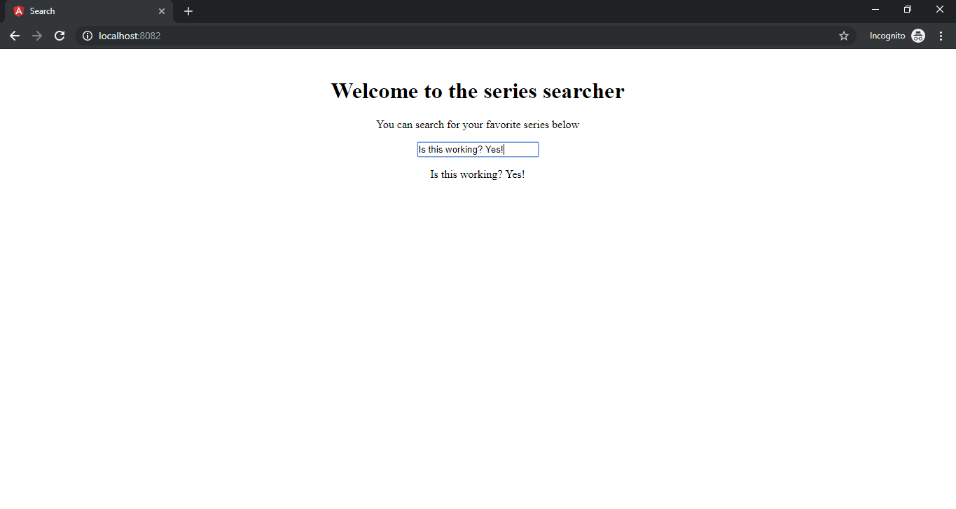
This return a plain input field like below:

You’ve only created an input form, but Angular doesn’t know the data it contains and cannot manipulate or control the input field. To control the input, you will use Angular form model to track value changes in an input element.
There are two ways to do that:
The major difference between the two is in the way they handle data flow from the input field. If you’re looking to build a robust, scalable component, use the Reactive form, but for the sake of this tutorial, you’d use a Template Driven form which is easier and recommended for this use case (You can read more about Angular forms here).
#4 Creating a Two-Way Data Binding Directive
To create a two-way data binding, you use the template syntax [(ngModel)] to bind data to an input field. This will automatically listen to the changes made in the input field. Before you can use the two-way data binding syntax (i.e [(ngModel)]), you need to first import the FormsModule into the app.
Open up the src/app/app.module.ts file and import FormsModule with:
import { FormsModule } from "@angular/forms";
Then declare the FormsModule in the import like:
imports: [
   BrowserModule,
   FormsModule
 ]
Now, you would be able to bind (or save) whatever the user types into the input field. To do so, you will create a class variable called searchInput and initialize it with an empty string in src/app/app.component.ts like this:
 @Component({
 selector: 'app-root',
 templateUrl: './app.component.html',
 styleUrls: ['./app.component.css']
})
export class AppComponent {
 public searchInput: String = '';
}
Then open up your src/app/app.component.html and bind [(ngModel)] to the searchInput in your input form.
<input type="text" [(ngModel)]="searchInput" placeholder="Enter the name of your series"/>
To test this, you can use string interpolation to see if the input changes while typing in the values by adding the following below the input tag:
<p> {{ searchInput }} </p>
If the values typed into the box show below it, you can move on to doing some exciting stuff with the form.
#5 Create a Custom Search Bar
You can now make the search bar work on real data. To do this, you need some data, so you can work with an array containing TV series data like below:
[
  {
       "name": "Prison Break",
       "description": "Structural Engineer Michael Scofield turns himself into the Fox River Penitentiary in order to break out his brother Lincoln Burrows, who is on death row for the murder of the Vice President's brother. But Lincoln was set up by some of the Company (an agency formed by corrupt government officials) guys, headed by General Jonathan Krantz. Michael breaks out from Fox River with his brother Lincoln and other convicts.",
       "genres": "Action, Crime, Drama, Mystery, Thriller",
       "releaseDate": "29 August 2005 (USA)"
   },
  {
       "name": "Vikings",
       "description": "The adventures of Ragnar Lothbrok: the greatest hero of his age. The series tells the saga of Ragnar's band of Viking brothers and his family as he rises to become King of the Viking tribes. As well as being a fearless warrior, Ragnar embodies the Norse traditions of devotion to the gods: legend has it that he was a direct descendant of Odin, the god of war and warriors.",
       "genres": "Action, Drama, History, War",
       "releaseDate": "3 March 2013 (USA)"
   },
{
       "name": "Person of Interest",
       "description": "A billionaire software-genius named Harold Finch creates a Machine for the government that is designed to detect acts of terror before they can happen, by monitoring the entire world through every cell-phone, email and surveillance camera. Finch discovered that the machine sees everything, potential terrorist acts and violent crimes that involve ordinary people.",
       "genres": "Action, Drama, Mystery, Sci-Fi, Thriller",
       "releaseDate": "22 September 2011 (USA)"
   },

,
 .
 .
//Truncated for brevity
]
Open up your app.component.ts and add the list above to it, just below the searchInput you created earlier.
export class AppComponent {
 public searchInput: String = '';
 public seriesList: Array<any> = [
 {
      "name": "Prison Break",
      "description": "Structural Engineer Michael Scofield turns himself into the Fox River Penitentiary in order to break out his brother Lincoln Burrows, who is on death row for the murder of the Vice President's brother. But Lincoln was set up by some of the Company (an agency formed by corrupt government officials) guys, headed by General Jonathan Krantz. Michael breaks out from Fox River with his brother Lincoln and other convicts.",
      "genres": "Action, Crime, Drama, Mystery, Thriller",
      "releaseDate": "29 August 2005 (USA)"
  }
.
.
//Truncated for brevity
]
}
You will be making use of Javascript filter method to match the input with the series you have in the seriesList, but then you have to create an empty list called searchResult where you will save your filtered search, then create a method named fetchSeries that searches for what you type in the search bar.
export class AppComponent {
 public searchInput:String = '';
 Public searchResult: Array<any> = [];
 public seriesList: Array<any> = [
//truncated for brevity
];
 constructor() {}

 fetchSeries(event: any) {
    if (event.target.value === '') {
      return this.searchResult = [];
    }
    this.searchResult = this.seriesList.filter((series) => {
      return series.name.toLowerCase().startsWith(event.target.value.toLowerCase());
    })
  }
}
In the fetchSeries method, you’ll pass in the content of the search bar as an argument to the function. You return an empty searchResult when the input is empty, then, use the Javascript filter method to return any series that starts with what you entered to the searchResult.
You can now bind the fetchSeries method to the search bar to listen for any key-up event.
<input type="text" #searchbar (keyup)="fetchSeries($event)" [(ngModel)]="searchInput" placeholder="Enter the name of your series" />
The #searchbar is a template reference variable which provides direct access to an element from a template and the (keyup) listens for a key-up event and takes the value of the searchbar variable as an argument. You can now display the search result below the search bar.
To do this, add a simple HTML list tag in the src/app/app.component.html to display the results.
<div style="text-align: center; margin: 3% 30%">
       <h1>Welcome to the series searcher</h1>
       <p>You can search for your favorite series below</p>
      <div class="searchbar">
     <div class="bar">
         <input type="text" #searchbar [(ngModel)]="searchInput" (keyup)="fetchSeries($event)" placeholder="Enter the name of your series" />
      </div>
   <ul>
     <li *ngFor="let show of searchResult">
        <p> {{ show.name }}</p>
     </li>
   </ul>
 </div>
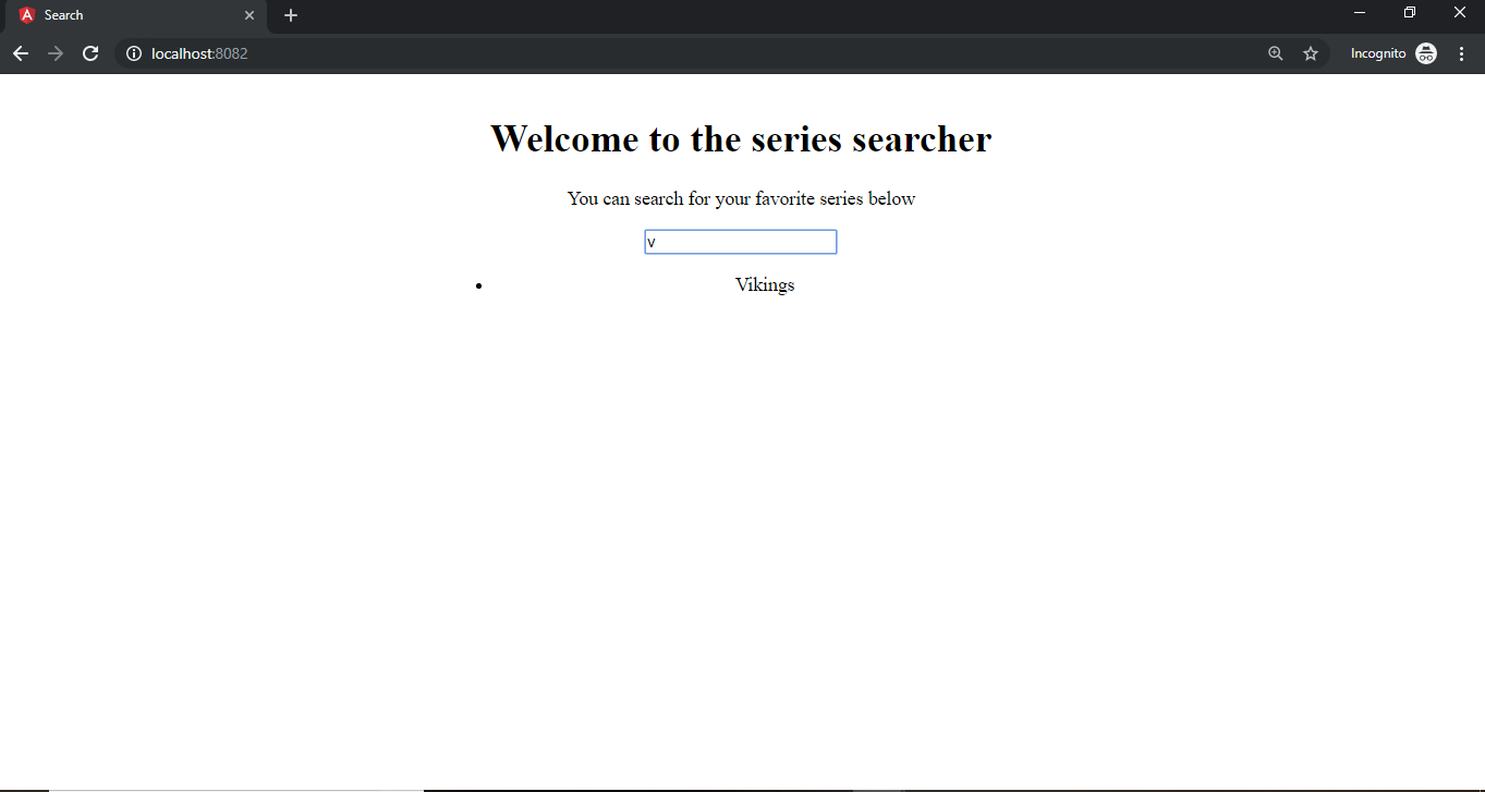
The *ngFor directive iterates through the searchResult and displays the name in a <p> tag using string interpolation. Here is an example:

A search for ‘p’ brought out list of series with names beginning with ‘p’. Good, you can move on to making the search bar a component on its own.
#6 Making the Custom Search Bar a Component
You have built a working custom search bar, but what happens if you want to duplicate the search bar on multiple pages in the app? Do you have to copy this into every single page? No! Componentization to the rescue. This allows you to split different chunks of code into components which makes them reusable in every place you want in your app. To do this, head over to the terminal and use the Angular command to generate a search bar component
ng generate component searchbarThis creates a searchbar folder inside your src/app folder and ‘automagically’ registers it as a component for you in the app.module.ts. You can confirm this by opening your src/app/app.module.ts and check your lists of components. You can now move the div with the class searchbar (which contains all the code you used to create it) into src/app/searchbar/searchbar.component.html
<div class="searchbar">
 <div class="bar">
   <input type="text" #searchbar [(ngModel)]="searchInput" (keyup)="fetchSeries($event)"
     placeholder="Enter the name of your series" />
 </div>
 <ul>
   <li *ngFor="let show of searchResult">
     <p> {{ show.name }}</p>
   </li>
 </ul>
</div>
Then you can also move all the class variables (searchInput, searchList and searchResult) and your fetchSeries method to src/app/searchbar/searchbar.component.ts
import { Component, OnInit } from '@angular/core';

@Component({
 selector: 'app-searchbar',
 templateUrl: './searchbar.component.html',
 styleUrls: ['./searchbar.component.css']
})
export class SearchbarComponent implements OnInit {

 constructor() { }

 public searchInput: String = '';
 public searchResult: Array<any> = [];
 public seriesList: Array<any> = [
 .
 //truncated for brevity
 ]


fetchSeries(value: String){
    if(value === '') {
      return this.searchResult = []
    }
    this.searchResult = this.seriesList.filter(function(series) {
      return series.name.toLowerCase().startsWith(value.toLowerCase())
    })
}
 ngOnInit() {}
}
Now to use the searchbar component, you can call it with its name (which is the value of the selector in the @Components params in searchbar.component.ts). The name here is app-searchbar, so you open up your src/app/app.component.html use it here like this:
<div style="text-align: center; margin: 3% 30%">
   <h1>Welcome to the series searcher</h1>
   <p>You can search for your favorite series below</p>
   <app-searchbar></app-searchbar>
</div>
The search bar should now be visible again and working normally.
#7 Styling the Custom Search Bar
Now you would want to make the search bar look better, don’t you? Open up the src/app/searchbar/searchbar.component.css and add some styles
*{
  margin:0;
  padding:0;
}

h4 {
  font-size: 16px;
}

p {
  font-size: smaller;
  color: black;
}

.bar{
  background-color:goldenrod;
  box-shadow: 0 1px 1px #ccc;
  border-radius: 2px;
  width: 400px;
  padding: 14px;
  margin: 45px auto 3px;
  position:relative;
}

.bar input{
  background:#fff no-repeat 13px 13px;
  border: none;
  width: 100%;
  line-height: 19px;
  padding: 11px 0;

  border-radius: 2px;
  box-shadow: 0 2px 8px #c4c4c4 inset;
  text-align: left;
  font-size: 14px;
  font-family: inherit;
  color: #738289;
  font-weight: bold;
  outline: none;
  text-indent: 40px;
}

ul{
  list-style: none;
  width: 425px;
  margin: 0 auto;
  text-align: left;
}

ul li{
  background: #ddd;
  border-bottom: 3px solid whitesmoke;
  padding: 5px;
  overflow: hidden;
}

ul li p{
  text-align: center;
  font-weight: bold;
  padding-top: 7px;
}
Now you have better looking custom search bar

#8 Extending the Custom Search bar
To make the custom search bar even better, you can allow users to click on the entries, and make it show more details about a selected series. You’ll need to modify the src/app/searchbar/searchbar.component.ts a little bit.
 //Truncated for brevity
export class SearchbarComponent implements OnInit {

 constructor() { }

 public searchInput: String = '';
 public searchResult: Array<any> = [];
 public toggle: Boolean = false;
 public selectedInput: any = {};
 public seriesList: Array<any> = [
 .
 //Truncated for brevity
]

fetchSeries(value: String){
    if(value === '') {
      return this.searchResult = []
    }
    this.searchResult = this.seriesList.filter(function(series) {
      return series.name.toLowerCase().startsWith(value.toLowerCase())
    })
    this.toggle = false;}

showDetails(series) {
       this.selectedInput = series;
       this.toggle = true;
       this.searchInput = series.name;
}
 ngOnInit() {
 }

}
Here’s an explanation of what the additions do:
- The public toggle: Boolean = false; was added to toggle between, the dropdown list view and the details card view
- The public selectedInput: any = {}; stores a series that was clicked to show it on the card’s view.
- The showDetails method will be attached to each search result of the search bar through a click listener. Once it is clicked on, it saves the particular series to selectedInput variable and updates the toggle and the search field
Now, attach a click listener to the list which shows the details card and create a card to show the details. Open up your src/app/searchbar/searchbar.component.html and add this code to it:
<div class="searchbar">
 <div class="bar">
     <input type="text" #searchbar [(ngModel)]="searchInput" (keyup)="fetchSeries(searchbar.value)" placeholder="Enter the name of your series" />
</div>
<ul>
       <li *ngFor="let show of searchResult" (click)="showDetails(show)" [hidden]="toggle" >
       <p> {{ show.name }}</p>
       </li>
 </ul>
 <div *ngIf="toggle" class="details">
    <h4 class="title">
      Title: {{ selectedInput.name }}
    </h4>
    <p class="description">
      <span class="sub-heading">Description: </span> {{selectedInput.description}}
    </p>
    <p class="release">
      <span class="sub-heading">Release Date: </span>{{selectedInput.releaseDate}}
    </p>
    <p class="genre">
      <span class="sub-heading">Genres: </span> {{selectedInput.genres}}
    </p>
  </div>
 </div>
A brief explanation the code above:
- The (click)=“showDetails(show)” attaches the method showDetails through a click listener and passes the ‘show’ object to it.
- The [hidden]=“toggle” binds the hidden HTML attribute to toggle which shows that tag only if hidden is true. Also the *ngIf=“toggle” attribute shows the <div> when toggle is true.
- String Interpolation is used to show other details in the selectedInput object e.g selectedInput.description shows the description of the selected series.
To add some styling to the details card. Open up src/app/searchbar/searchbar.component.css and append the style to it:
 .details {
 padding: 8px;
 width: 400px;
 height: auto;
 overflow: auto;
 margin: 0 auto;
 box-shadow: 10px 10px 8px 2px #888888;
}

.title {
 border-bottom: 2px groove gold;
 margin-bottom: 6px;
}

.sub-heading {
 text-transform: capitalize;
 font-weight: bold;
}
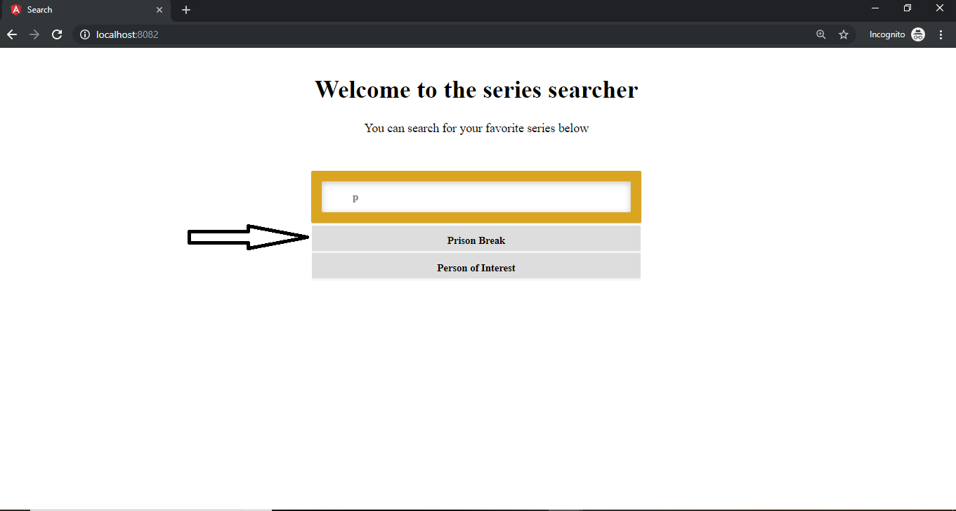
Now, you can test what has been done so far; you can search for ‘P’ and get the following result:
On clicking on the first result, you now have:
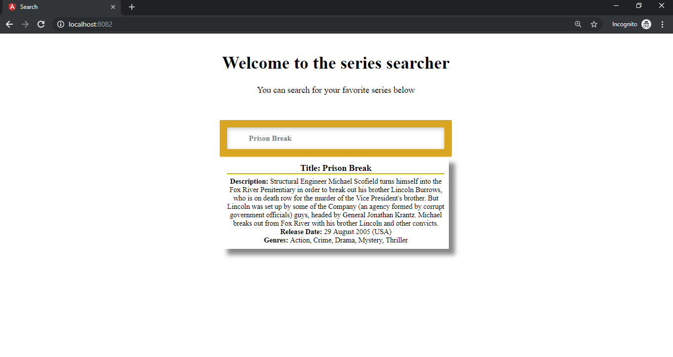
Now you have a nice looking details page.
Conclusion
Now you’ve successfully created a custom search bar, and also functions as a TV series search app. You can extend the functionality of the search bar to make it fetch the data from an API instead of the searchList array used. If you’re interested, you can check out How to get JSON data from an API.